Shohei Ohtani Branding Concept
This project explores a personal branding concept for Shohei Ohtani through the design of a mock business card and a branded newsletter. Created using Adobe InDesign, the work focuses on clean typography, cohesive layout, and a modern visual identity that reflects Ohtani’s professionalism and global presence.
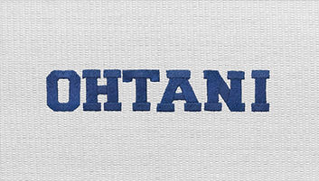
Business Card
Imagining myself as Shohei Ohtani’s social media manager. I incorporated signature elements that make Shohei recognizable—Dodger blue accents and white fabric-inspired textures from his uniform—while focusing on clean, professional layout and brand consistency.

Newsletter
This newsletter was thoughtfully designed to capture the essence of Shohei Ohtani’s career both on and off the field. From conducting independent research to curating imagery and crafting a balanced layout, every element was carefully considered to tell a cohesive visual story. The design emphasizes clarity, consistency, and modern aesthetics, highlighting Ohtani’s impact while maintaining a clean, editorial feel.


